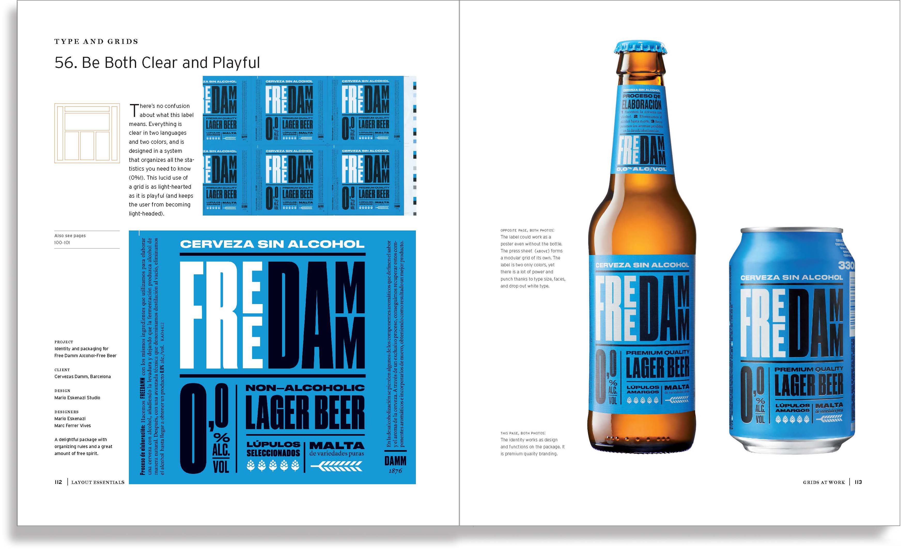
|
|
Pink:
The History of
a Punk, Pretty,
Powerful Color
Client: Thames
& Hudson
Published in conjunction with an exhibit curated by
Dr. Valerie Steele and shown at the Museum of FIT,
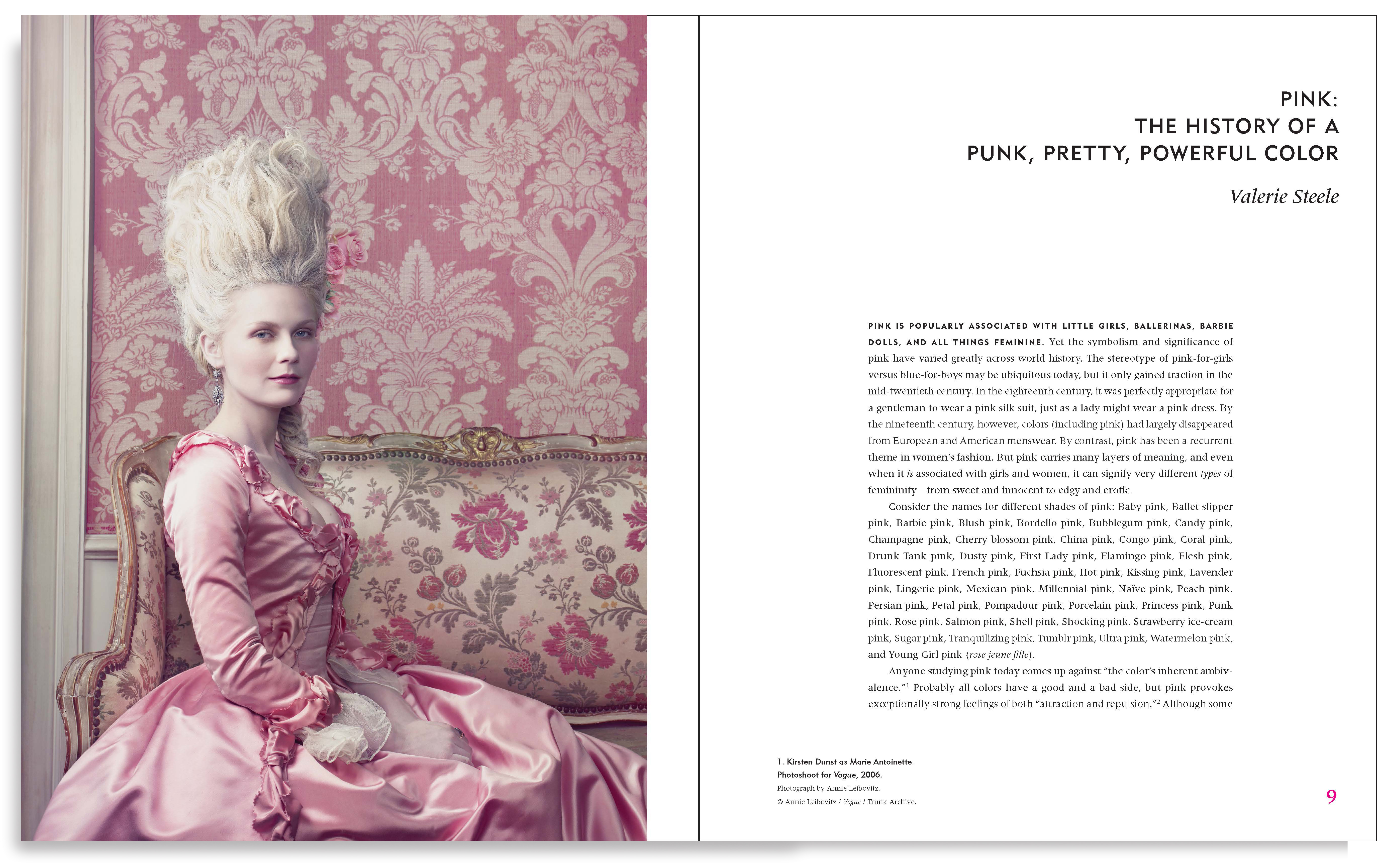
Pink helps change preconceived ideas and gives the history of a color formerly
thought to be for men only.
Also, did you know that pink is “the navy blue
of India”?
The MFIT exhibit ended in January 2019, but the book is still available for purchase here.
|
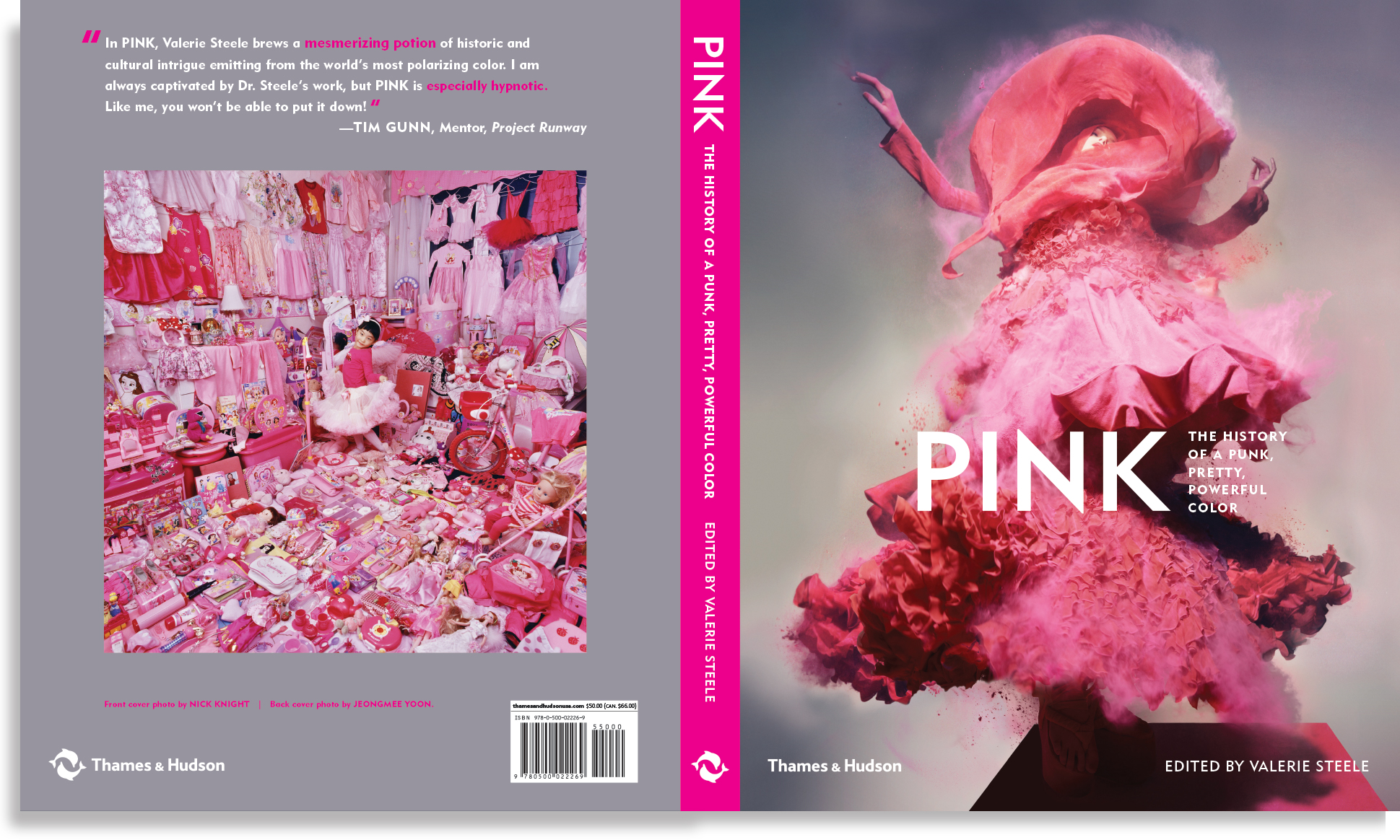
Cover photo by Nick Knight
Cover design by Nick Knight & BTDnyc

|
| |
|
|
|
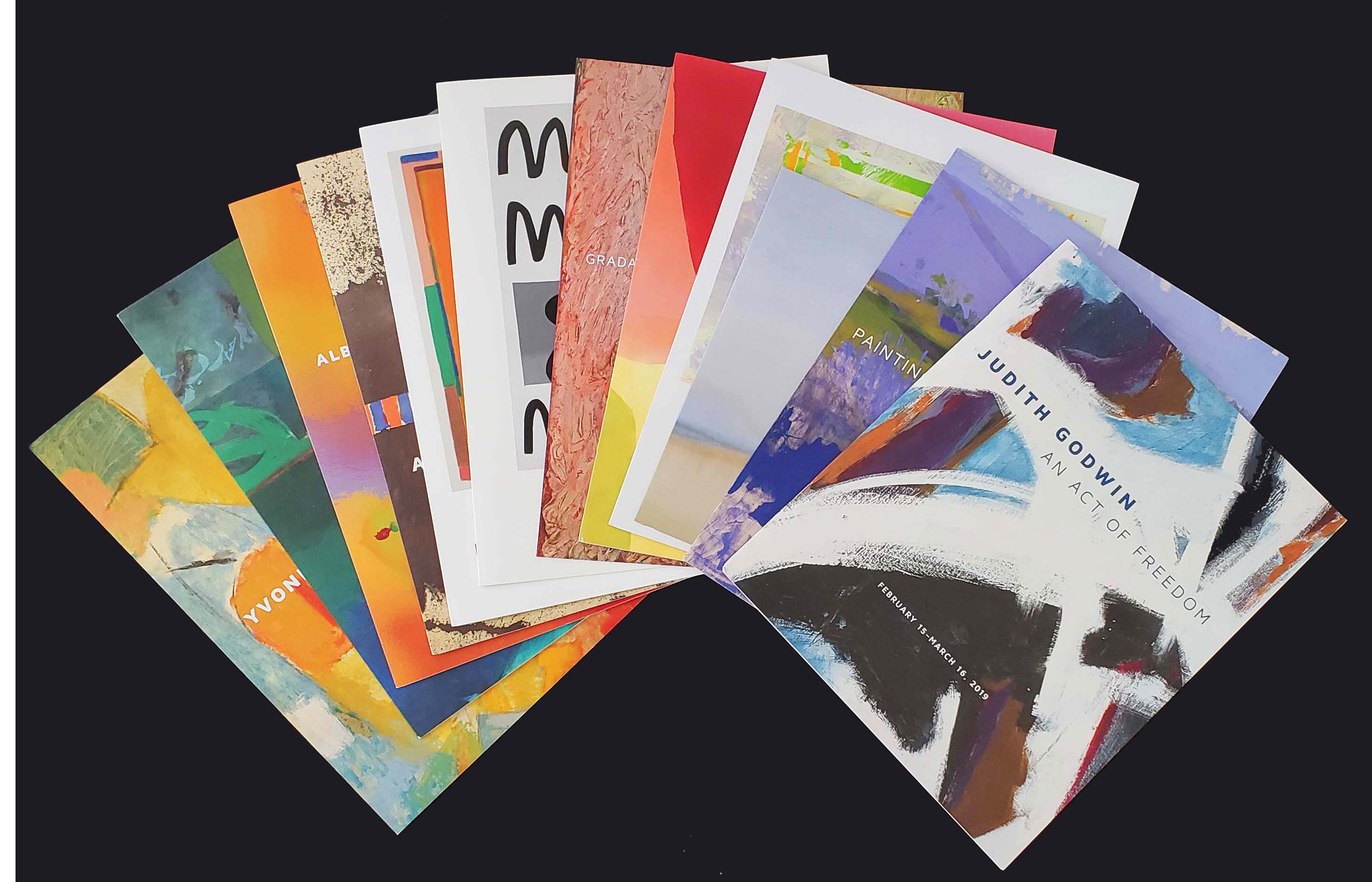
Exhibit
Brochures
Client: Berry Campbell Gallery
Gallery owners Christine Berry and Martha Campbell bring new energy and attention to prominent and mid-career artists in the modernist tradition, especially amazing women such as Judith Godwin, Susan Vecsey, Jill Nathanson, and Yvonne Thomas, whose work may not be as well known as their male counterparts.
|
|
| |
|
|
|
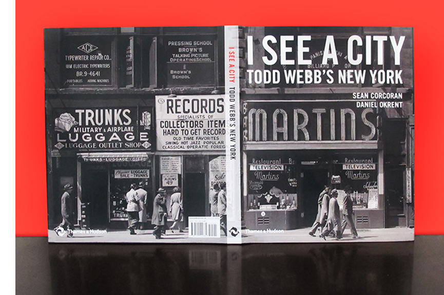
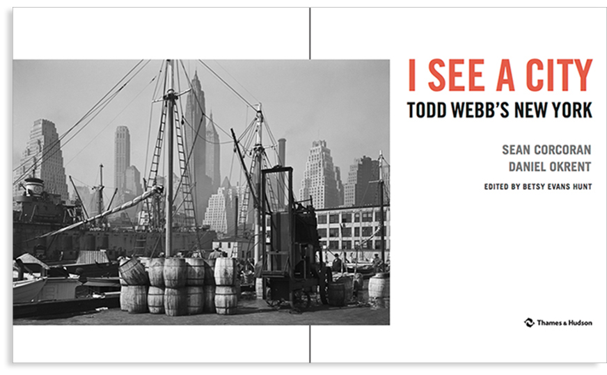
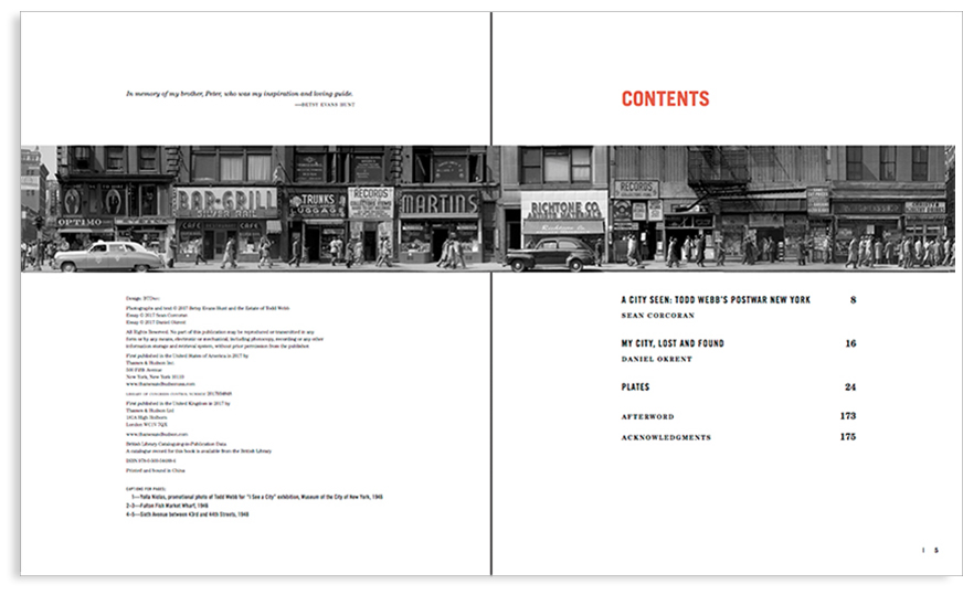
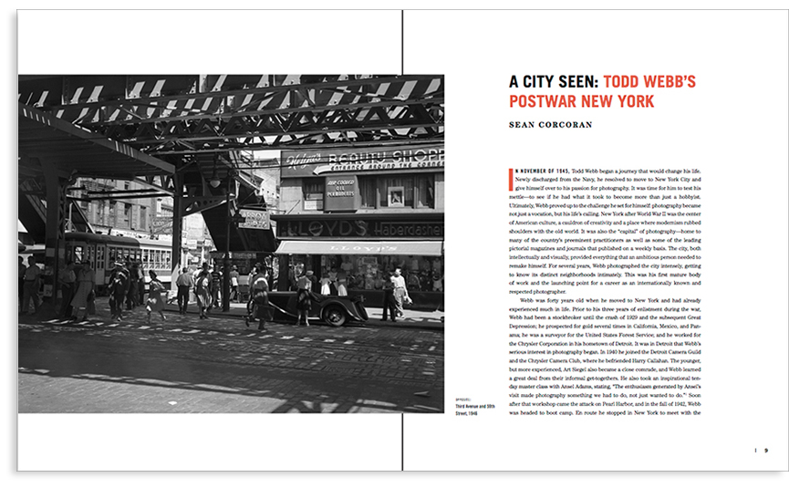
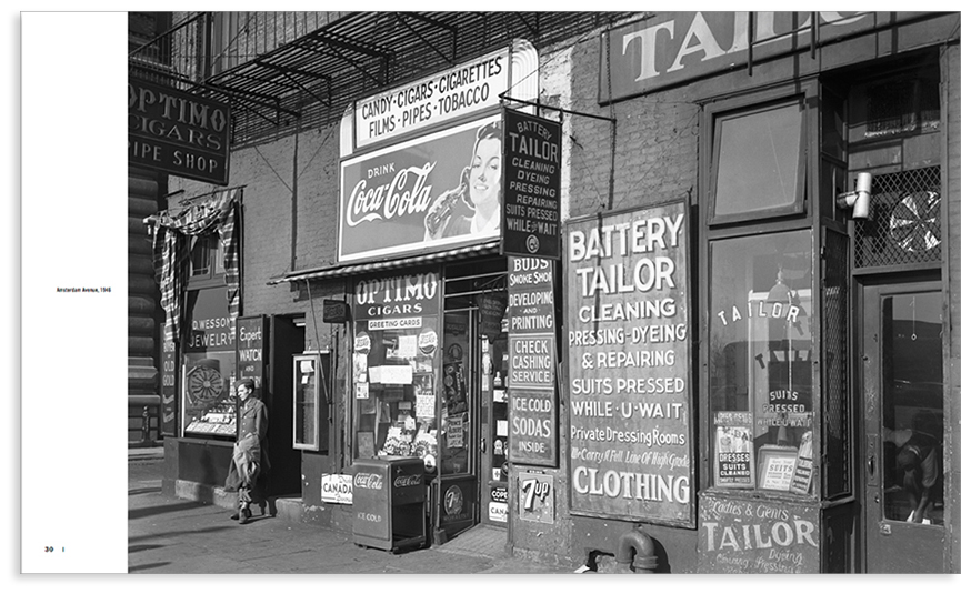
I See a City:
Todd Webb’s
New York
Client: Thames & Hudson
I See a City: Todd Webb’s New York is a collectible coda to the Museum of the City of New York's exhibit, "A City Seen: Todd Webb’s Postwar New York, 1945–1960.”
Today, many of us capture daily life on our hand-held devices. Decades ago, Todd Webb used a a large-format camera and a tripod to make his rich and energetic photos. Images in I See a City exalt a grittier time—when life was normalizing after World War II; the Lower East Side was far from hip; and when elevated trains provided opportunities for noir studies in abstract shadows.
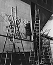
The book includes portraits of Webb’s celebrated friends (Alfred Stieglitz, Berenice Abbott, Harry Callahan, Helen Leavitt and Gordon Parks, to name a few) as well as evocative and poetic essays by Sean Corcoran and Daniel Okrent. Webb's photos honor a range of neighborhoods and neighbors. Most thrilling, though, are his shots of media before it was social: Welcome Home signs, cacaphonies of type on walls and marquees, a scribbled succinct death notice stating business will go on, and a billboard painter at work in Times Square.
The exhibition
A City Seen closes on September 5, 2017; the spectacular book arrives in November, 2017.
|
|
| |
|
|
|
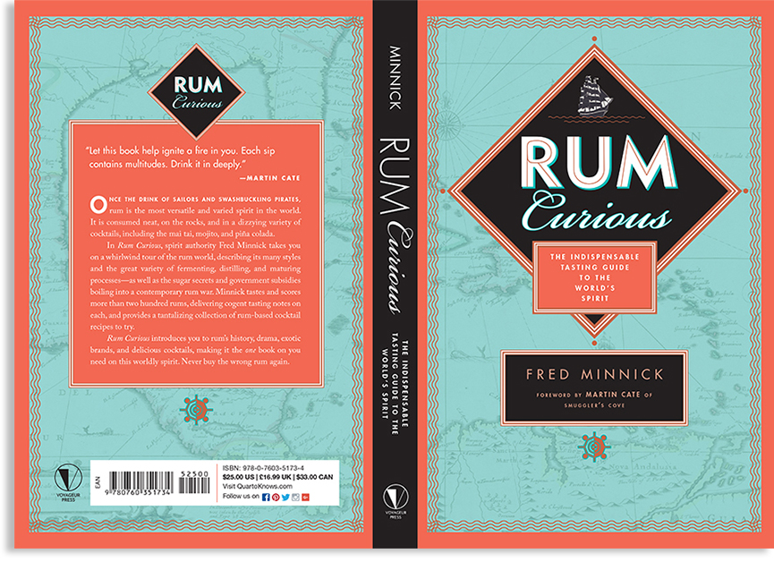
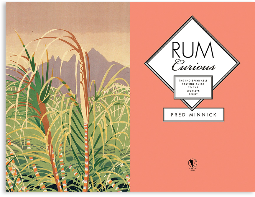
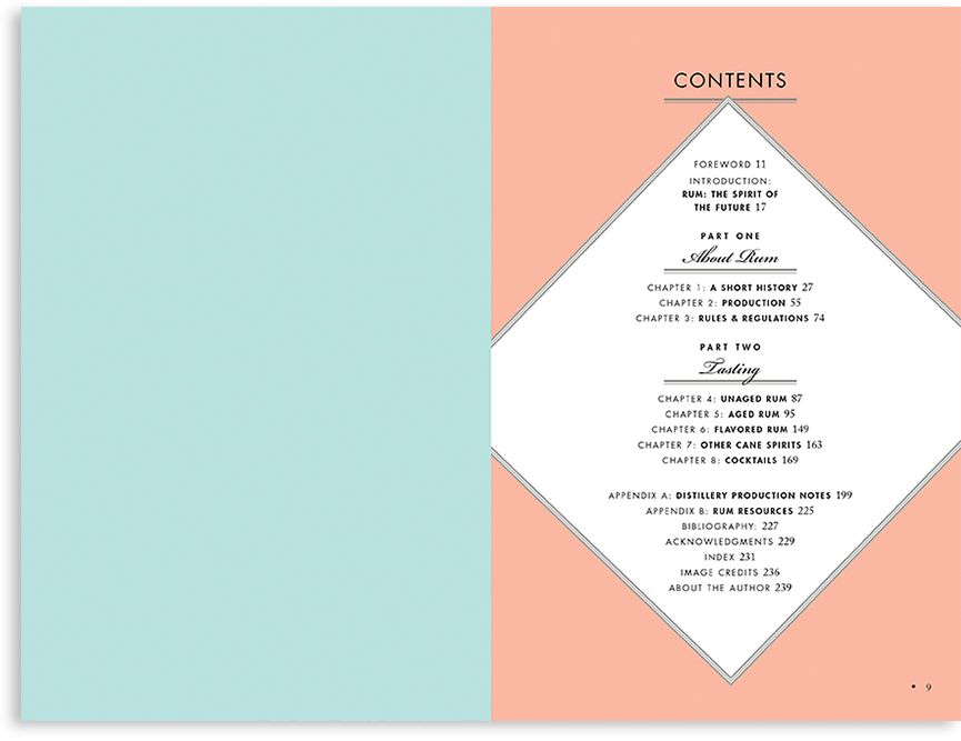
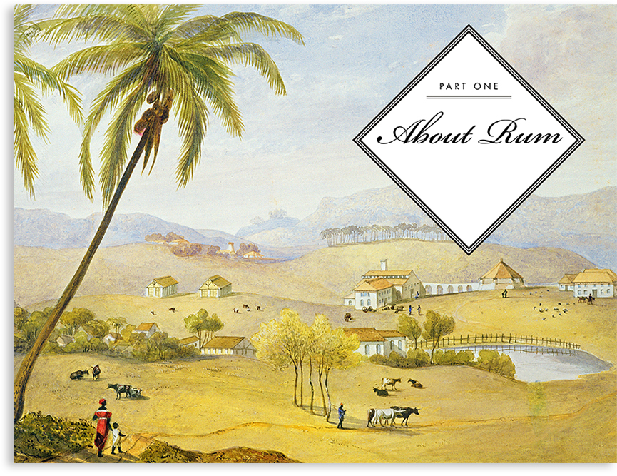
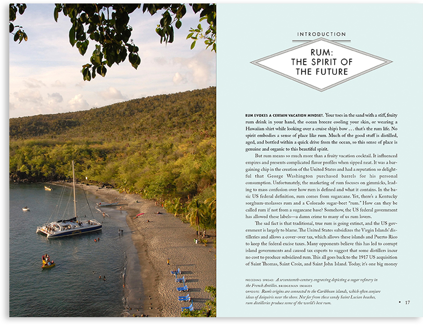
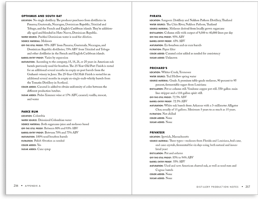
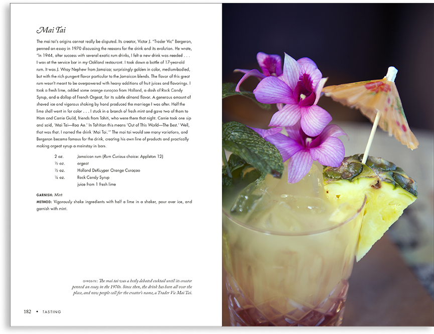
Tasting Rum
Client: Quarto
Yo-ho-ho. BTD’s readable typography well-paced visuals help Fred take the reader/drinker on a tour through the history of rum and its manufacture—along with a detailed rating of every rum imaginable. Cheers!
|
|
| |
|
|
|
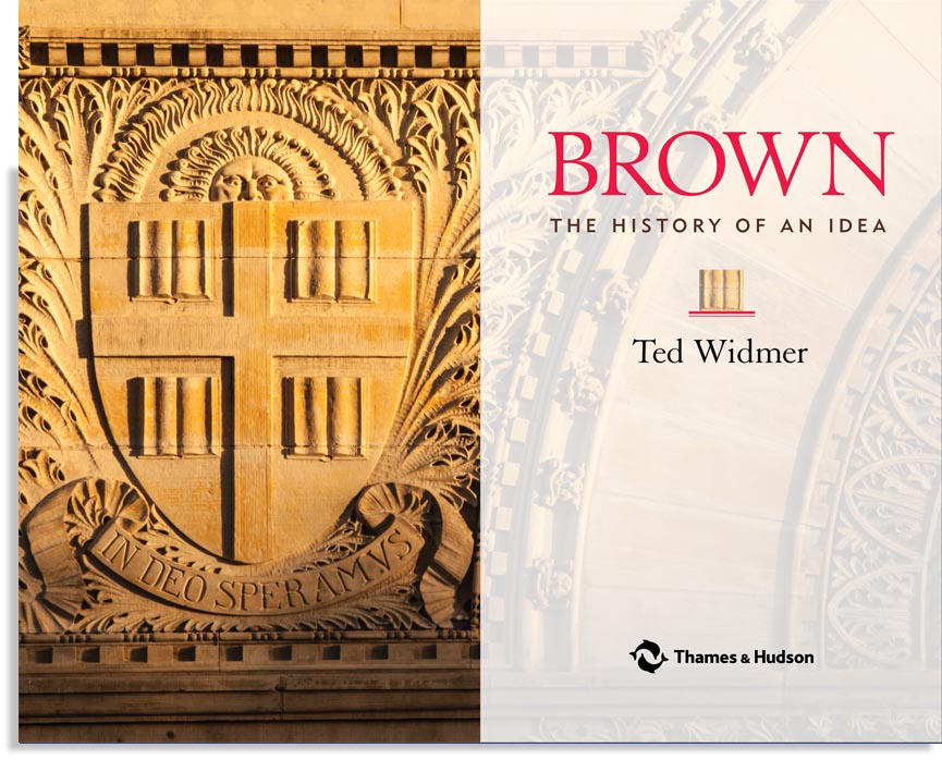
Brown. The History of an Idea
Client: Thames & Hudson
Ted Widmer's history celebrates Brown's 250th anniversary and its genesis in early Rhode Island's "cacaphony of free thought."
BTD helped bring Widmer's script to life and print by: managing the project (enlisting brilliant editors for copyediting and proofreading stages; mapping out a schedule) and designing the classical look of the jacket and book interior.
Widmer explains the effect of early Rhode Island's freedom of thought on Brown. The university is beholden to the influence of Roger Williams, the founder of Rhode Island, who was banished from Massachusetts for thinking a bit too freely and for "asking too many questions—about the separation of church and state, about how the Indians were treated, about nearly every assumption underpinning the cold logic of Boston," with its strict Puritan ideals as exemplified by ministers like Cotton Mather.
After Massachusetts officials "requested" that Roger Williams leave their jurisdiction, he arrived on Narragansett land, thanking the "special providence" that had brought him to a welcoming place. The Narragansett Indians accepted Williams and "gave him land as part of the original 'Providence Plantations.'" Williams learned the Narragansett language and wrote about Narragansett customs, manners and worship. Williams also greatly admired Narragansett spirituality and self-government. Eventually, Williams's idea of "soul liberty" attracted other seekers as well as possibly less spiritual seafaring merchants.
One such businessman, Chad Brown, arrived in Rhode Island in 1638 after leaving Boston "for conscience sake." Chad Brown's great-grandson James Brown II was a businessman who first set to sea in 1727. Four of James's sons—Joseph, John, Nicholas and Moses—were also astute entrepreneurs. Of these, John was a slave trader, Moses was a leading abolitionist.
Although the university began in Newport as Rhode Island College, it moved in 1769 thanks to the Brown brothers, who gave the school some of their land in Providence. In 1804, Nicholas Brown, Jr. gave a substantial sum of money to Rhode Island College, spurring the name change. The rest is history, and in Ted's tome.
|


|
| |
|
|
|
Mrs. Wheelbarrow's Practical Pantry
Client: W. W. Norton & Company.
Designing a cookbook is a great multi-level puzzle. Ensuring usability and a clear hierarchy is particularly important when canning chemistry is involved. Cathy Barrow's encyclopedic book contains recipes and techniques for "putting up" a vast range of foodstuffs for year-round use. With gorgeous photos by Christopher Hirsheimer and Melissa Hamilton, the tome is a winner. The pros agree; Mrs. W...'s Practical Pantry won an IACP Award. BTD is tickled to have designed the interior.
Devising a marketable jacket mixes many ingredients: a concept that hits a moving target and differs from competitors' jackets; aesthetics; taste; surprise; delight—in short, everything AND the kitchen sink. Sometimes, concepts are sent back to the metaphorical test kitchen. Such was the case with our jacket comps (comprehensives).
Although BTD's jacket designs for Mrs. Wheelbarrow's Practical Pantry were canned (not used), we thought some of the approaches were worth, well, preserving. So, here are a few of the killed approaches. To see the final jacket by non-BTD-related designer Jaya Miceli, visit Cathy Barrow's site. Better yet, buy a hardcover copy of Cathy Barrow's wonderful book.
|


|
| |
|
|
|
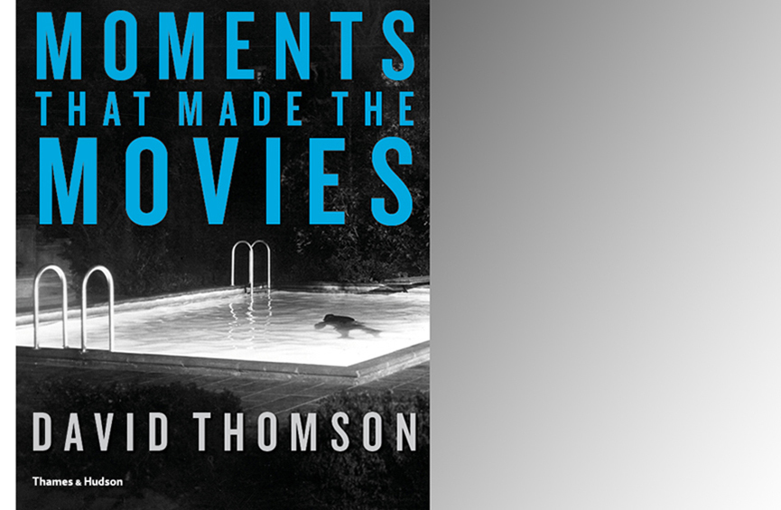
Moments That Made The Movies
Client: Thames & Hudson
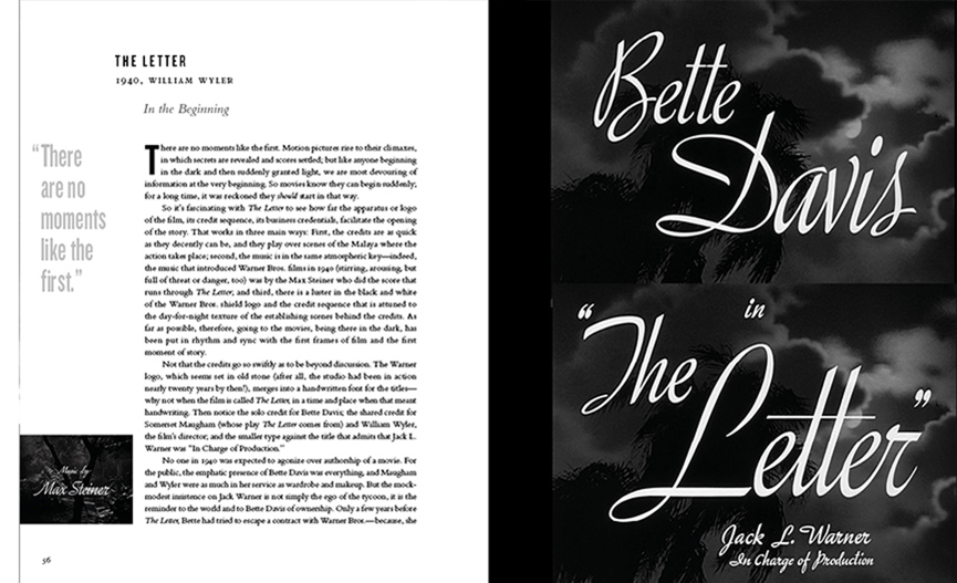
In his first illustrated book, iconic film critic David Thomson focuses on key scenes in selected films. To make the project go without a hitch,* we helped suggest and select images, collaborated on pull quotes, and devised a fair number of the essay subtitles. We also designed the jacket and book interior.
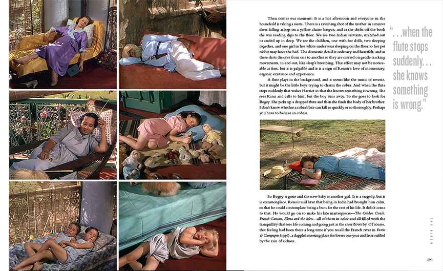
From this rich collection, our "Designer's Choices" are: 1. Thomson's essay on "The Letter," especially his meticulous description of the film titles and 2. The images from Jean Renoir's "The River," with frames showing how Renoir had his father's eye for color and composition.
"A coffee table book with a brain," according to reviewer Dennis Drabelle published in The Washington Post (and The Manchester Guardian), Moments That Made The Movies is perfect reading at Oscar or any time.
*There is a hitch in the book; Thomson discusses a number of films by that Master of Suspense, Alfred Hitchkock—aka Hitch.
|
|
| |
|
|
|
Edgar Allan Poe:
Terror of the Soul
Client: Isaac Gewirtz, PhD, Curator of the Berg Collection of the The New York Public Library
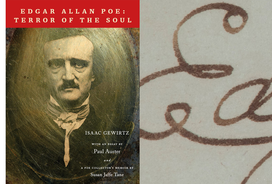
BTD produced (contracted editors and printer) and designed Edgar Allan Poe: Terror of the Soul, a 224-page paperback of illustrated essays by Paul Auster, Isaac Gewirtz, and Susan Jaffe Tane. Although not a catalogue for the exhibition at The Morgan Library & Museum from October 4, 2013 to January 26, 2014, the Poe tome is in the library shops in time for fans flocking to the show.
On a related note (but unrelated to BTD), the late Lou Reed, whose album "The Raven" is based on Poe's work and who referred to Poe as his "spiritual forefather," was hauntingly eloquent about Edgar Allan Poe's influence.
Top: Book's cover with Poe's signature as backdrop; Middle: Opening spread and handwritten notes for Paul Auster's essay followed by text spread showing illustration by Edmund Dulac; Bottom: checklist spread with art by Aubrey Beardsley.
|


|
| |
|
|
|
GRAND CENTRAL:
How a Train Station Transformed America
We were honored to work with Grand Central Publishing on the interior of Sam Roberts 's easily-portable tribute to Grand Central Terminal's centennial.
(Wordsmiths: see page 9 of Sam's fact-filled text to learn why Grand Central is more like a "terminal" than a "station".)
Conceived by engineer William J. Wilgus, Grand Central was designed by a politically-driven mash-up of architecture firms Reed & Stem and Warren & Wetmore. Wilgus also proposed the elevated roadway encircling the terminal and connecting Park Avenue North and South.
• • •
In addition to the design, BTDnyc contributed photo editing support. As a nod to Pentagram's anniversary logo, we art directed a shot of the iconic clock at 7:13. Among other suggestions, we proposed finding an overhead photo showing the centrality of Manhattan's great edifice.
Many of the photos in the book are as well-known as the building itself, but few are as delightful as the image of gents fixing the iconic ball clock.
Jacket design by Anne Twomey.
|


|
| |
|
|
|
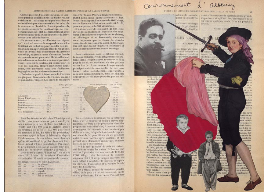
JOSEPH CORNELL'S MANUAL OF MARVELS
Around the 1930s, Joseph Cornell changed a 1911 French Agricultural Manual from almanac to art by drawing in, cutting out, collaging on, as well as inserting tracing paper and origami into many of its pages.
Cornell's surrealist intervention, now in the Philadelphia Museum of Art, is too fragile for public viewing. Happily, Thames & Hudson has just published an abridged facsimile, along with a book of essays and a CD showing each page Cornell brought into another dimension. All elements are housed in a box we designed to evoke a carton of produce.
Devising fresh packaging and the facsimile was tricky, not to mention humbling (in comparison, the book of essays was a piece of cake). But all of the efforts to recreate Cornell's playful work were well worth it. Julie Bloom seems to agree; in her December 2, 2012 article in The New York Times Book Review she declares the results marvelous.
Small image: box exterior; Top large image: the inside of the box, with CD, Facsimile, and Book of Essays; Middle and bottom images: two of the many spreads Cornell manipulated.
|


|
| |
|
| | | | | | | |