|
JUST IN! Revised and Updated. First published in 2009, Layout Essentials sold over 50,000 copies in hardback and paperback, combined. In addition to the English-language versions, the decade-old Layout Essentials exists in Korean, German, Dutch, French, Taiwanese, Japanese, and Portugese. Italian publishers did not seem to be interested in a book about grids. Layout Essentials was useful enough —and sold enough— to warrant an updated edition. To improve the work in the best way possible, the author (um . . . Beth) read and understood all of the online reviews (a bit painful and a lot helpful). So, the revised and updated edition includes: more principles that are more clearly-worded, additional explanatory sidebars, cross references, and details of images, as well as work across currently-used media such as print, desktops, tablets, and devices. Why purchase a book when you can look up everything online? Well, the biggest reason to have this updated version is the additional amazing work by a stellar and international range of designers. |
The new Layout Essentials includes work by recent graduates and established luminaries; many of the contributors are also educators. Carefully-culled examples are from: Dayna Iphill, a recent graduate of The New York City College of Technology; accomplished designers such as Jason Heuer and Suzanne Dell’Orto; acclaimed international stars Seans Adams of Burning Settlers Cabin and a serial author (and more!); Kyra Clarke and her team at Threaded Studio, an Auckland-based agency in New Zealand; Drew Hodges, founder of SpotCo and DrewDesignCo and author of Broadway, From Rent to Revolution; Mario Eskenazi of Mario Eskenazi Studio in Barcelona, Spain; Bobby C. Martin, Jr. and Jennifer Kinon of Original Champions of Design; the polymath Emily Oberman and her team at Pentagram; and Richard Turley, who founded a newspaper while creatively-directing Weiden+Kennedy. Published in January 2019, the new softback book retains strong work from the first edition. Design evolves quickly, so there may be gaps. We look forward to knowing what you think! |
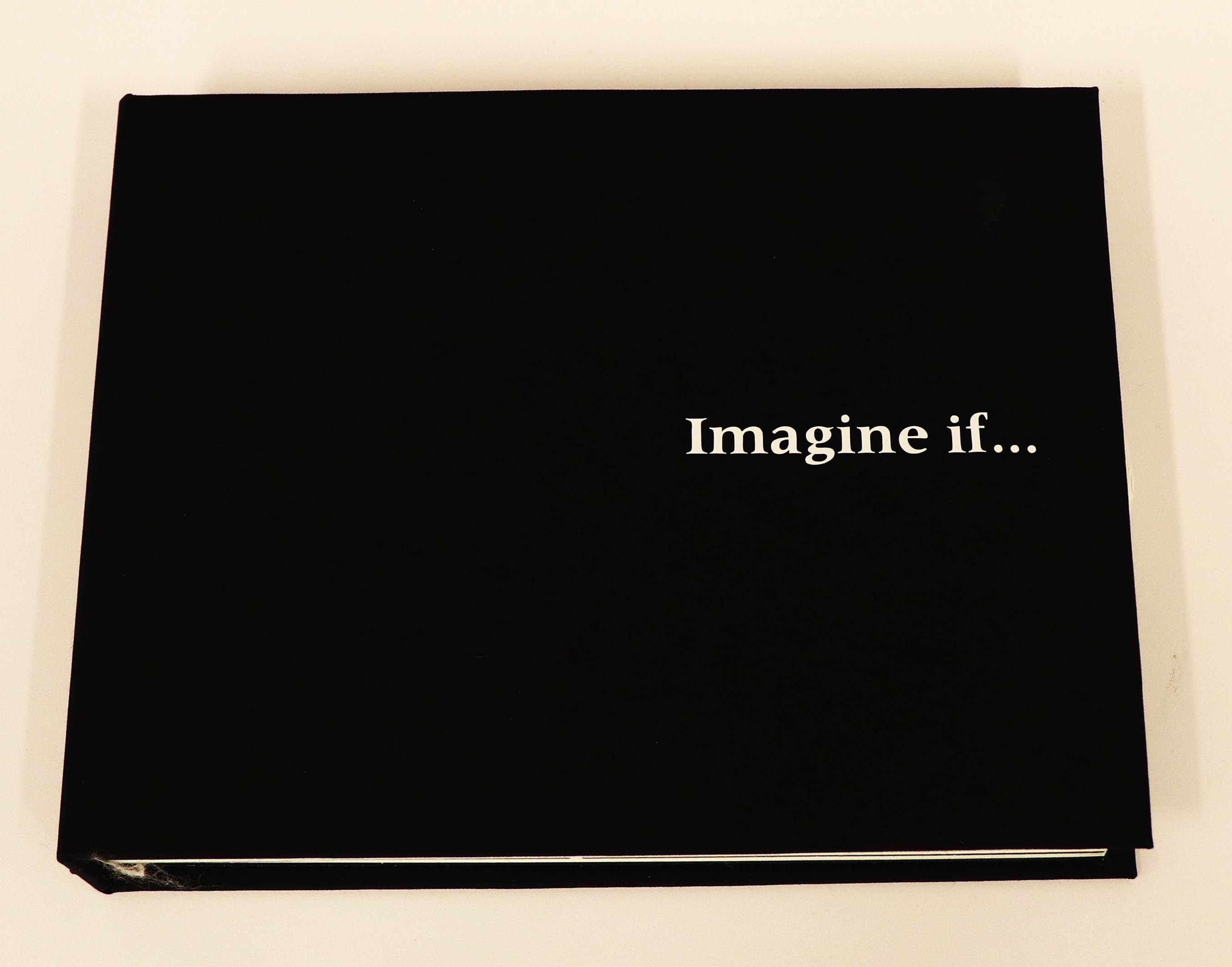
 Front cover of Layout Essentials, revised and updated edition, published in 2019.
To view more, visit NEW STUFF. |
||||
|
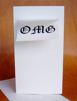
Imagine If. . . Book and Essay by Maggie Chan, Imagine If. . . is a story that speaks about life and its various perspectives. In this life we are all given individual roles we must fulfill before our proverbial hour glass runs out. Life is hard, life is short, and life is unfair. But that’s only one side of it. Life is mischievous, mysterious, and follows no one set path. Life is what you make of it, experience it and live it. My initial thesis idea dealt with the idea of ‘life after life’. There is no such thing as a definitive “death”, and because of that, there is also no true self. At the time of choosing this topic I felt as though I was at a cross road in my life. I was entering my senior year, and was going to graduate and leave FIT in the May, marking the end of my school life. After that I would be starting a new chapter of my life, with hopefully a job, and goal to work towards. To me this project was always meant to be |
my way of letting go of a piece of myself. A way to move into a new me. It was the inner argument with myself, that I was always afraid to tell others but was finally able to share. Since the project’s initial conception I knew it was going to end up being a book, a story really. At first it was going to be a book of symbols with a literal representation of my original thesis statement. The final product would have been an adequate representation of my topic, a literal translation for the statement “life after life.” However, ultimately it would have only served as a false representation of my original reason for chasing the topic to begin with. I would have been me taking the easy way out. So when
|
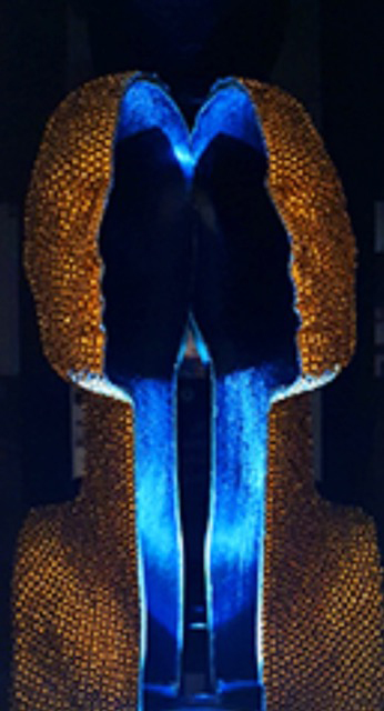
 Front cover of of Imagine If. . ., Maggie Chan’s Senior Thesis project.
|
||||
  Created by Maggie Chan, and photographed by Jason Huang
|
||||||
|
Hollow Glamour Three Dimensional Piece and Essay by Patricia Chang, FIT Graduate 2017 Having spent two semesters on my Senior Thesis, I saw many things come to light and gained a deeper understand of cultural appropriation. Researching for my thesis, I realized that cultural appropriation is an intricate and complex topic that isn’t always addressed properly. But we all have to start somewhere, so I began with black culture in hip-hop. I focused on the situation and location that gave birth to what we now know as one of the most popular music forms worldwide, and found that this music genre was rich in history. When it comes to cultural appropriation, there are proper ways to appropriate and vice versa, but there isn’t a guideline, so how does one know when it is wrong or not? In my thesis, I mainly compare the South Korean music industry to American hip-hop. As Korean pop music becomes popular worldwide rage, it is reviewed under a harsher light. Hip-hop as a fashion style is built on products already made rather than a culture with its own designs and motifs. Therefore, it is hard to say when one particular artist wears low-hanging jeans or gold jewelry that he or she is appropriating black |
culture in hip-hop. After all, it can be called a fashion sense, unlike a Colombian actress that wore a kimono for her movie premiere. A kimono is distinctively Japanese, from the cut of the fabric to the patterns weaved into the cloth. This example is used to bring up the point whether the actress is appropriating another culture or not. This blurred lines made my research and consequently backing my topic harder than it should have been. So I moved beyond cultural appropriation, to compare the Korean culture which clashes with American and black culture. Korean beliefs are very different because of the small diversity in their population to the vast diversity in America. When cultural beliefs that stems from many years are placed side by side, I showed my viewers the usage of hip-hop in Korean pop music, which is alien to their culture. It then became very easy to know where the influence of their music came from. My three dimensional piece is an abstract representation of my views of the Korean music industry. It is gold and covered with tiny ornaments, reminiscent of hip-hop famous jewelries called bling. The three dimensional piece is cut in half to show the viewers the hollowness of the cultural appropriation in Korean pop music. |
 Close of of 3-dimensional piece of Hollow Glamour, Patricia Chang’s Senior Thesis project.
|
||||
 Work and photos by Patricia Chang
|
||||||
|
The second part of my thesis is a book that accompanies the three-dimensional visual of my thesis and which contains hard-core info. Within the book, there is an info-graph about the entertainment companies in South Korea, their business strategies, and a compilation of idol groups. I also discuss two popular rappers in Korea and their appropriation of hip-hop. I support my topic further with the struggles of mix heritage artists in the music industry due to their skin color. |
 Work and photos by Patricia Chang
|
|||||
|
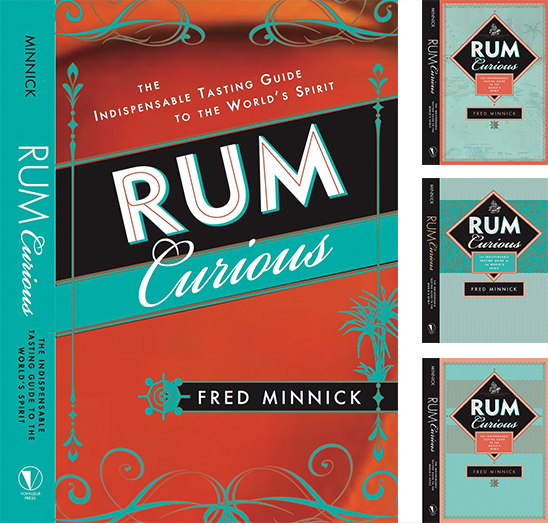
The Unchosen 2017 Our lively approach to a cover for a book about tasting rum got the deep six in favor of a look that echoes elegant premium bottle packaging. So that our preferred design doesn’t vanish into the briny deep of jettisoned concepts, we’re showing it here, along with other studies. You can see the chosen cover in the animation on our site's home screen. Let us know which concept you prefer. |
 |
|||||
|
Blast from the Past 2017 In cleaning out the flat file (Amazingly, there’s still a flat file in the BTD office!), I came across some very old catalogues (2001–2002) for Andrews McMeel, featuring tiny novelty tomes published by now-defunct Ariel Books. Before throwing out the catalogue, FIT Senior/BTD intern Patricia Chang photographed some of the books and the covers—designed by former BTD-ers Ann Obringer Zipkin, Mia Risberg, Lorie Pagnozzi, Sabrina Bowers and yours truly. Here are most of the covers. You can see all of the covers here. They’re a blast from the past and still cute as ever. 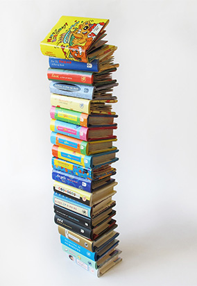 |
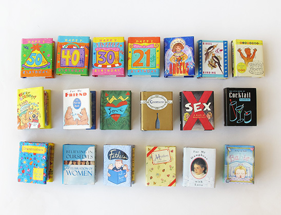 Some of the novelty tomes in BTD’s collection.
 Images depicting the size of the tiny tomes in comparison to hands, as well as the experience of opening each page and seeing the pop-ups.
|
|||||
|
Just the Writing (mostly) 2015 Iwas tickled that Workman Art Director Janet Vicario enjoyed the content on this BTD site enough to enlist me for Just Type 2016, the second edition of a wall calendar she conceived and designed. Vicario’s Just Type appeals to designers and civilian type-lovers alike; her handsome and complex format covers a lot of points (pun intended). In addition to the hard-core calendar with dates in different weights and specifications, the calendar contains brief explanatory descriptions, history, and key characteristics of the fonts. Both the 2016 wall calendar and a weekly Planner required research, writing, and highlighting key characteristics of each month’s font (essentially, the upper third of each of the twelve months; see the encircled areas). As a quasi type and history geek, I was familiar with the life stories of many typefaces and their creators. But a deeper dive into history yielded riches, peppered with a bit of trivia. For instance, October’s type was Baskerville. Although I knew that John Baskerville (1706–1775) was a printer and expert penman who supported himself by teaching writing & bookkeeping and cutting inscriptions on tombstones, I didn’t know that around 1740, Baskerville began to make and paint japanned |
articles such as tea trays and bread baskets—and made them throughout his life even after he designed his new printing type. Baskerville (type) was a great alternative to William Caslon’s eponymous face. But because Caslon (type and man) essentially monopolized the type industry in 18th century England, Baskerville (type) was not wholeheartedly embraced—possibly explaining why Baskerville (man) continued to manufacture japanned goods. The most entertaining primary research about October’s face yielded a letter from sly Ben Franklin, who wrote to Baskerville about a trick he played on a Caslon loyalist to prove that the higher contrast of Baskerville’s new type did not “hurt the eyes.” Despite a mother lode of history, there was no room to ramble. So, reams of info resulted in short squibs such as: By cutting a type with greater consistency in size and form than existing faces, Benjamin Franklin defended his English colleague’s typeface despite criticism that its thin and narrow strokes “hurt the eye.” Today, Baskerville is considered an uncontroversial workhorse for books * * * |
 All twelve months contain fascinating riches, enough for laymen and professionals alike to enjoy the history and see the attributes of each month’s calendar typeface. A detail is below. |
||||
 |
||||||
|
Chic Chick 2015 Many or even most designers are inspired by things found in nature, but this Wyandotte—a breed of chicken that apparently originated in the United States, has a Dutch name, and is owned by a friend in the Acquitaine region of France— 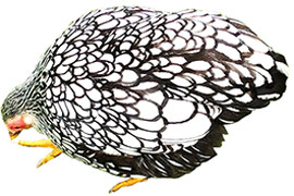 Wyandotte
|
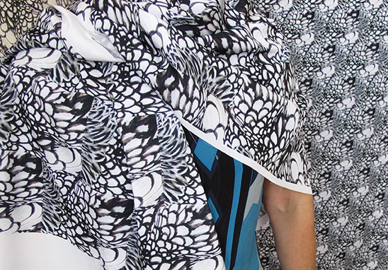 Fabric inspired by Wyandotte plumage.
|
|||||
|
Can Do Part Two Sequel, 2015 If you think you can, you can.” This was the slogan on a fortune cookie from a recent take-out Chinese dinner. Oddly, the fortune cookie presents the same adage as Virgil’s Latin phrase “Possunt, quia posse videntur”—“They can, because they think they can.” I learned the Virgil quote five years ago when Arielle Jennings, the student I mentored throughout high school, gave me a silver jewel box—inscribed with the above Latin phrase—containing a silver heart-shaped pendant embellished by both of our birthstones. My peridot went missing a while back, and Arielle’s emerald-like stone disappeared only recently, but I still wear the pendant daily. (Are the lost baubles a metaphor for “bling erodes; heart abides”?). |
In 2014, when Arielle graduated from the Rhode Island School of Design with a degree in Illustration, I used the Virgil quote on a congratulations card. After a post-graduation year of living in Providence, RI, Arielle is now back in New York City pursuing work. Both Virgil and the philosopher of Wonton Food Inc. will be helpful guides as Arielle navigates the shoals of job listings, HR screeners and tips from contacts. Of course, even with the power of positive thinking, perseverance, and a stong foundation from RISD, Arielle will confront reality. She can because she thinks she can. But luck, timing and additional connections will also aid her quest for fulfilling and remunerative work. Got leads? |
 May 2014. Arielle holding her diploma. Alba Corrado calligraphed each graduate’s name onto the diploma designed by the late John Howard Benson, a sculptor and calligrapher who taught at RISD.
|
||||
|
Cadence Font and Essay by Cassandra Garruzzo, 2014 The font Cadence is an ongoing project very dear to my heart. First, a little bit of background: I have been figure skating ever since I was nine years old. It is my favorite sport and I still skate for exercise and leisure. Naturally, when I was assigned the task to create my own font, my first instinct was to try and think of a way to marry two of my loves: typography and figure skating. I know that there are display fonts that were created using body positions in dance and in skating. One example of this technique is Alphabet Photography by Jennifer Blakeley, 2011. I did not want to repeat this style, as beautiful as the results are. I wanted to find a different way to combine the movement and flow of skating with the rhythm of a beautiful and coherent font. I decided to try to choreograph a footwork for the ice that creates one attached, sequenced alphabet. I wanted the letters to connect at the bottom from beginning to end and be skated in one pass across the ice. This proved to be far more difficult than I originally figured. Through weeks of trial and error, between drawing letter forms and attempting to skate them, I finally was able to come up with a footwork. The letter forms are not quite perfect, and the skating is slightly more difficult than originally intended, but that is the part that excites me most: its not over. I still have the opportunity to make it better and continue resolving my skating techniques, as well as, my typography skills. Now, I feel that my feet understand my hands a little bit better, and I continue to try to perfect that relationship. |
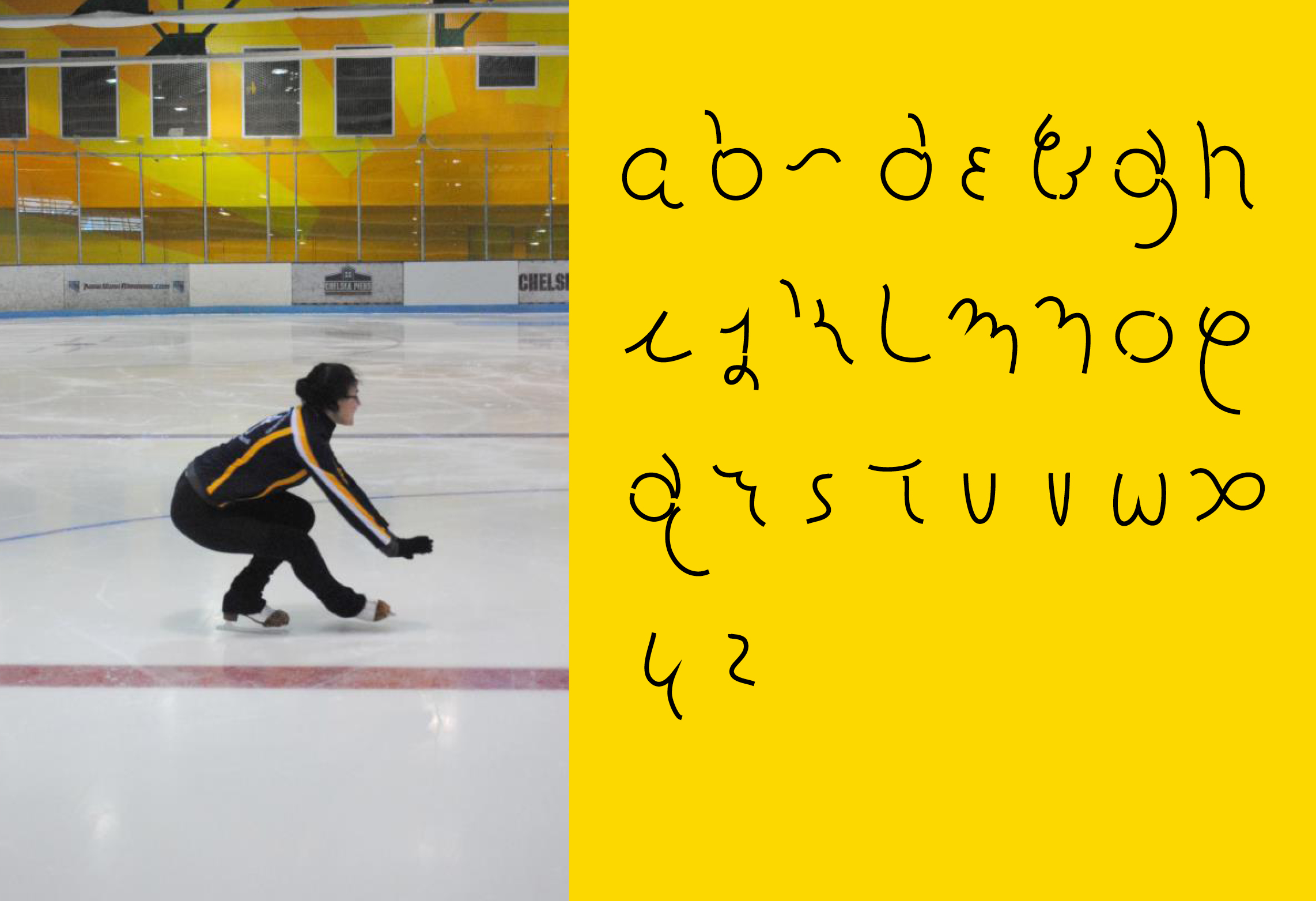 Cassandra Garruzzo skating (top left). Photo taken by Vanessa Quiles. Hand drawn font by Cassandra (top right).
 Final choreographed footwork drawn out by Cassandra.
|
|||||
|
International Creations 2013 F edrigoni a paper company based in Verona, Italy, enlisted eight design firms from across the globe (including BTDnyc) to design a 16-page section for its promotional book, 16/2. The medium? Fabulous Fedrigoni papers. Printing specs? Full-color printing with up to two special effects. Challenge? Tell a story and instill a sense of local identity. Such a great project with so few limits? Daunting (but exciting)! “Materiality” springs to mind and hand. Participants worked with paper textures, reflections of inks, varnishes, and three-dimensional embossings in this deluxe tactile artifact (watch this space for images—or check out Fedrigoni! As with all group projects, different firms solved the same design brief with an amazing range of approaches. Linear stories, specific sculptures, abstracted symbols, conceptual book-within-a-book all show the versatility of Fedrigoni papers (not to mention enduring Italian craft). 16/2 also demonstrates that an increasingly small and uniform world still contains strikingly-local details. BTDnyc’s section pays homage to the vernacular iconography and typography of road signs along U.S. highways. Although 16/2’s contributors work digitally, spending a few hours of face-to-face time at Frankfurt with some of the luminaries rendered the work and its makers even more real and inspiring. (At a remarkable presentation at the Frankfurt Book Fair, Threaded’s Kyra Clark began her remarks in the Modi language, using customary Maori introductions and greetings.) Printed BTDnyc photo essay © Fedrigoni. |
 Internationally-recognizable, yet still very North American in flavor.
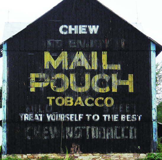 Mail Pouch Pentimento, Western, PA.
|
|||||
|
A Station’s Tale 2013 In his book celebrating Grand Central’s centennial, Sam Roberts notes that the terminal has a role in Mark Helprin’s “Winter’s Tale, in which the protagonist, Peter Lake, secretes himself in a small compartment above the cerulean ceiling.” A month before its hundredth birthday in February 2013, film crews shot Winter’s Tale in the station—also the site of the Apple Store. IMDb describes Winter’s Tale as “A fantasy story set in 19th Century and present-day Manhattan.” Movie extras straddled the dual timeframes; costumed for historical scenes in the film, they checked their present-day devices while awaiting their moment in the lights. IMDb’s synopsis skews time; construction on Grand Central Terminal began in 1903—i.e. in the 20th Century. In a shameless plug for a BTDnyc book interior project, we note that Roberts’s anniversary tribute is available as an Open EBook—which means actors in Winter’s Tale can bone up on history using a number of different E-Readers.
Note to typographers: stories in this section currently sport hash marks instead of typographer’s quotes. This indignity will be corrected. |
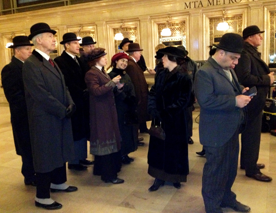 An extra (front right) refers to 21st century devices while costumed for an earlier era.
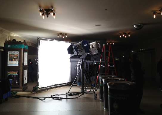 Ready for my close-up, Mr. Akiva Goldsman.
|
|||||
|
The Biz Goes South 2012 BTD is now in Suite 424. After 25 years in Room 511, I declined to renew its lease and took a space one floor down, on the south side of the building. While the old space afforded a lot of wall space for attaching works-in-progress as well as inspiration and outmoded tools such as T-squares and triangles, Suite 424 afforded the opportunity to start clean. Moving 25 years-worth of stuff—especially given the changes in technology over two and a half decades—called upon the editing skills I thought I had until I had to part with almost 400 square feet of stuff. What’s archival and what’s worthless junk? For some items, I solved the dilemma by taking a quick iPhoto of stages of design mockups from back in the day, when letterforms were photocopied, pieced together, sliced apart, and then photocopied again. It’s easy to see why Apple revolutionized the industry. Streamlining won out. So many items went to the Housing Works Thrift Store a few blocks from the office that for a while, the store bore an odd resemblance to the ever-emptying Room 511. I wish I’d realized that Martha Rosler’s Meta Monumental Garage Sale at MoMA had accepted donations; the installation may have been a perfect venue for some outdated objects. BTW: does anyone want a Daige waxer? If you’re in NYC, come check out the new office. Again, it’s the same great building, but a spanking new space. 611 Broadway, Suite 424, on the Houston Street side—with a view of a noir-ish neon Parking Garage sign and the Freedom Tower under construction. |
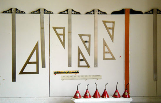 The Mac rendered T-squares (the name is Set Square in the UK) and triangles things of the past. I’m just as happy to use them as decor.
|
|||||
 Rude mechanicals: Late 1980s curved type, hand-manipulated with an X-Acto knife.
|
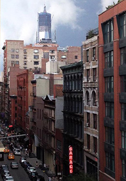 Room with a view: old Garage sign and new Freedom Tower under construction.
|
|||||
|
Upcycling! 2012 Tools of the trade evolve or become obsolete, but parting is such sweet sorrow. One way to avoid absolute parting is to create cards created using paper and binding samples. Some of the recycled samples are made from Crane’s paper with Reich Translucent Vellum (immediate right), and Crane’s paper with Old English Letraset (far right, above). |
 |
 |
||||
|
Can Do Spirit 2010 Possunt, quia posse videntur. When she graduated from New York City’s High School of Art & Design, Arielle Jennings summed up our three years in the AIGA/NY Mentoring Program by giving me a silver jewel box inscribed with that phrase—and containing a heart pendant with both of our birthstones. The translation of the Latin poet Virgil’s quote is “they can, because they think they can.” The locket means the world to me. After being paired during Arielle’s sophomore year, we met every two weeks without fail. Our meetings were cordial and full of mutual respect, but a bit cautious at first. By summer of her sophomore year, reserve gave way to warmth, trust and love. We were clear about Arielle’s goals: college, college, and college. In Junior year, Arielle’s academic record was stronger than her drawing skills, but her heart was set on art school. So, we drew. And drew. And drew. Although we enjoyed all of the activities organized by the Mentoring Program, most of our meetings during Junior year involved drawing together at various locations outdoors and in—always with a frappuccino or cocoa as a treat. Arielle’s perseverance paid off. She won an AIGA-sponsored spot in an SVA summer program and drew some more. With all of her practice and guidance |
from SVA, Arielle loosened up. In her senior year, we spent hours working on portfolios as well as scholarship and college applications, supplemented by AIGA projects, trips to MoMA to see Tim Burton’s amazing work. Occasionally, we just hung out. The hard work paid off. Arielle got into 8 of her 10 schools, was wait-listed at one (Brown), and is now a sleep-deprived RISD student. Arielle has great discipline. She and I have great chemistry, even after I was outed as being a “very old person.” In addition, Arielle’s mother, Deborah, was very supportive of everything we did. Although mentoring is one-on-one with the adult and student, I found that out of the four students I’ve mentored, the two greatest successes involved parents who trusted the program. Out of the three students I mentored prior to Arielle, two of the pairings didn’t sing. Luck helps—but more importantly, so does keeping at it. The complete version of the quote Arielle chose is: “Hos successus altit: possunt, quia posse videntur.” “These successes encourage: they can, because they think they can.” Arielle says that my help and encouragement led to her success. Her successes led to self-confidence and a great start in life at one of the best art schools in the country. I’ve learned a lot from Arielle. We can because we think we can. I wear the locket daily to remind myself. |
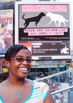 Arielle Jennings, RISD 2014, in front of the Clear Channel billboard displaying a poster she devised in 2010 for Create Don't Hate
 Arielle in 2009 |
||||